


10 Amazing Techniques To Build Beautiful Responsive Web Design
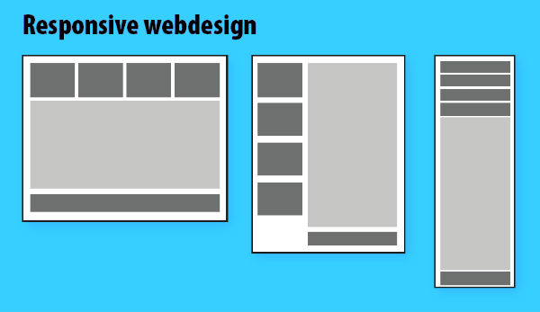
Responsive web design is a lot more than plain stretching of design elements. It’s all about delivering a website in countless ways in accordance to the width and resolutions of different screens. As a website designer, using responsive web design will allow you to add mobile-friendly features into the site, making it look and function pleasingly on different types of mobile devices.
If you’ve been assigned the project of delivering a fully responsive website then this is a post which will allow you to dig deep into some amazingly effective ways of designing one. Continue reading the post to find more on the same.
- Hiding navigation menus
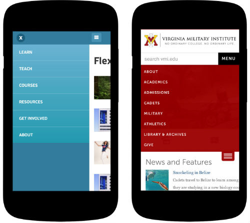
Since responsive websites need to target smaller screens, it is recommended to hide the main navigation menu. Instead, you can opt for combining an icon and text for indicating the user about the menu. You can either include a simple drop-down menu which slides down or an overlay technique where the menu expands and covers the entire screen.
- Ensure a perfect balance of font weights and sizes
It is vital for you to balance the size ratio between paragraph and header text. Make sure all the large headers look great on the mobile device, in case they are being stretched over a few lines. Since the contemporary mobile devices come with high-resolution screens, make sure the text remains easier-to-read.
- Opt for making the images flexible and more workable
With the adaptive sizing and re-sizing of images width, you can conveniently make them more and more flexible. Adaptive Images has emerged as one of the finest tools for adding utmost flexibility to images. By sizing the website in accordance to the mobile users, you can easily come up with a truly remarkable responsive design website which loads faster. On the contrary, you may even opt for using variable breakpoints and storing different image sizes in the data available for varied screen resolutions.
- Maintain optimal reading widths
If you’re inclined on widening a layout for a larger screen, it is vital for you to consider the line lengths of your content. It is interesting to note that a lengthy line of text is harder to read simply because it’s difficult to follow it line-by-line. Likewise, text displayed in the form of too short lines tends to break the flow of reading because the user has to move his/her eyes back-and-forth on a repetitive basis. Therefore, follow a common practice of maintaining the line lengths to 60-75 characters. You can do this by setting the text areas to contain a max-width of 500/700 pixels approximately.
- Serve responsive images using Cookies
A popular designer named Keith Clark recommends using cookies for serving smaller images to mobile users. In simple words, you can use Javascript for populating a cookie using the current screen’s dimensions. Now, all the subsequent request made by web browser will automatically pass the data to the web server which would then know the size for the screen to which the responsive images need to be catered.
- Replace functionality of an enlarged image with a scrollable gallery page
If you want to accommodate an enlarged image on a device with small screen, it is recommended to opt for a scrollable page or a thoroughly swipeable carousel equipped with right and left arrows.
- Optimize the UX for touch screens
Touch screens are quite different as compared to the conventional mobile screens. Being intuitive by default, these touch screens are more subtle when it comes to maintaining the site’s navigation. You need to remember that hover events come out inconsistently on different touch screens. Hence, you need to disable them and replace the same with touch events. Likewise, if you feel that the content to be displayed on mouse hover isn’t vital, just choose to disable it on touch screens.

8. Get rid of all the unimportant content for your website
There are areas within your web design which never get used when the final website is viewed via a mobile device. So, it is essential for you to get rid of all such unwanted content by applying a not_mobile_class to all the non-essential elements available within the site. Think about all the elements which are mandatory for a mobile website.
- Increase the size of links and buttons for enhanced visibility and user experience
Instead of making the buttons smaller in size, go ahead with making them larger so that they are easier to tap. Here, it is interesting to note that larger buttons enhance the overall usability of the website. By availing the convenience of clicking the links anywhere, the visitors prefer staying more time on your web pages.
- Opt for using less images
You can attain a range of effects such as button hover states and background gradients with the help of CSS and HTML. By using fonts for all the icons, you can save yourself from the hassles of creating images. So, ensure to use fonts which are scalable, load faster and have cleaner edges, serving as a great match for the retina displays.
Wrapping Up
Creating beautiful responsive web designs requires an extensive amount of time and efforts. Now that you’re familiar with ten of these simple-to-follow techniques for creating responsive web designs, I’m sure building a perfect responsive website won’t be a thing to fear anymore.
Tutorial Categories:


Thank you for such nice article. It is useful for who just started making responsive sites.
Thank you for such nice article. It is useful for who just started making responsive sites.