


Importance practices on how responsive design looks nice
As a web provider, it is your responsibility to check whether the website that you have designed works well on all the devices. Wherefore, you need to provide an unfettered browsing experience on all the devices of different sizes. This has also been noted that people have now developed more affinity towards mobile devices.

If you do not believe!
Determine the bounce rate of your unoptimized site
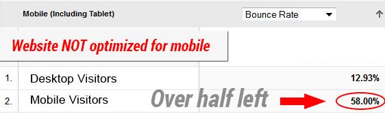
For those who do not agree can go for a simple test. Login to your Google Analytics account and then move down to ‘Audience’ > ‘Mobile’ > ‘Overview’ and there you will find the statistics of your website.
The graph for this sample website is clearly depicts that it is not optimized for mobile devices.
In this blog we are going to discuss what not to do while designing your a highly optimized responsive website.
Let your buttons and links breathe
Mobile apps already have a restricted area and we won’t be doing justice to our app if we won’t give the buttons and links proper place to breathe in. Obfuscating things will mar all your design efforts and this is the reason that even responsive web designs also fail to create an impact on the users.
Moreover, instead of keeping the buttons of smaller size on mobile you can go for keeping them larger, which can make them more clickable and easy to tap. This is not just a good technique for small devices as making buttons large will make it easier to tap on the devices. This is not just applicable to the small screen devices such as smartphones, however it works perfectly fine on the small screens as well.
It is seen that large buttons tend to improve the usability of a web design. Likewise, text links also benefit when they are kept large as they also become more clickable. For instance, in a blogging website instead of making a button say “Find out more” you can go ahead and make the whole content a link which tends to open wherever the audience clicks it.
The reason being is the more easier it is to use, the more people will use it.
Abrupt Break points
Breakpoints are important while designing a website, as the designer place them haywire which is a misappropriate thing to do. Moreover, you need to know that the breakpoints define the resolution of a responsive web design. It is noted that breakpoints are the browser width which are declared by Media Queries and they tend to change the layout of the website if the range of the browser is declared within.
While designing your website you need to be very selective and open up a wide expanse while choosing your breakpoints. However, you need to pay attention to some of the sizes such as:
320px and 480px: Both these sizes fit small size smartphones ( iPhone 4, iPhone 5 series or Samsung Galaxy series) or we can say the older versions.
768px: This is best fit size which is perfect for Phables or the large size Smartphones (Samsung Note series and iPhone 6) and tablets.
1024px: 1024px or higher: This is the size selected for developing applications for the size of laptop or desktop
Do not keep un- responsive images
One of the biggest mistakes which people commit while designing a responsive web site is that they fail to make the images responsive. The easiest way to get responsive images is to get it by adaptive sizing and resizing the width of the images.
Though making images responsive can be accomplished in numerous ways, however the easiest way to make that your images responsive, is by using a handy tool names as Adaptive images. You need to realize the fact that sizing your images according to the mobile users is the best thing one can do for their responsive web design, as this is important for having a pretty good loading speed.
Moreover, you can also opt for using multiple breakpoints and store images of varying sizes in your data as suitable, which can fit into screens with different sizes and resolutions, however this might pose some problems which it comes to bandwidth usage. One cannot not just create their whole website on the assumption that all the users will have access to one kind of bandwidth.
Remove Elements that are not required
Making a responsive website is certainly not an easy task and if you need to excel this art you need to keep in mind that you need to keep the design minimalistic.
There are many things such as content or design elements which are not supposed to be kept in a responsive web design. The scanty space which we have in our mobile devices restrict us to keep minimal elements.
If you have some obtrusive non essential elements
still on your responsive website , simply just remove them as they unnecessarily remain there and obfuscate your design for mobile devices.
One of the simplest ways of doing so is to add a .not_mobile class for certain specific objects which are supposed to be removed when someone opens up your site on a mobile device. Else you can permanently remove all these elements from your mobile site.
Do not keep elements of full sizes
Another thing which we generally forget while designing a responsive website is not to compress the content and elements of the website. We have incredible programs named as GZIP which are used to compress all the page resources for transmitting the data easily on your network. By doing so you will allow to reduce the number of bytes sent on every single page or element. This makes it easier for the user to browse and scour over your website from devices which are of varying bandwidth.
This was about compressing the elements and moreover designers can also expedite the process by cutting out all the line breaks and white spaces. This will help you further to reduce the size of the files and streamlines the flow.
Final thoughts!
This means that the structure and appearance of your website must acclimatize to the size of the device without hampering the content and functions on any device. No matter which device I choose to visit the website, be it a laptop or a smartphone, it should deliver the same experience on all each.
Tutorial Categories: